> ## Documentation Index
> Fetch the complete documentation index at: https://docs.datanumia.com/llms.txt
> Use this file to discover all available pages before exploring further.
# How to parameter webcomponents?
# How to parameter a web component ?
This article outlines the technical specifications for customizing styles using CSS within a web-based component. The customization process involves three main layers:
* **Global Layer**: Responsible for defining and managing the styles for atomic elements and global themes.
* **Web Component Layer**: Develops custom graphics and styles for specific components, allowing for scoped and advanced customizations.
* **Client/Customer Layer**: Has the ability to override default styles through provider-specific CSS files or inline styles.
The focus is on enabling extensive customization of styles while ensuring consistency and flexibility. Key points include:
* **On-boarding Phase**: Where initial customizations are set up.
* **Use of Shadow DOM**: Encapsulate styles and prevent conflicts with external applications.
* **Override CSS Variables**: If needed by the provider, some variables can be customized.
Additionally, an example integration and screen demos are provided to illustrate the customization process.
**Layers explanations and responsibilities**
***
The **Global Layer** is responsible for managing the following aspects:
* **Font**: The typeface used throughout the application.
* **Font-size**: The size of the text.
* **Font-family**: The specific font family used (e.g., Arial, Helvetica, Times New Roman).
* **Color Theme**: The overall color scheme, including primary and secondary colors.
* **Radius**: The border radius applied to elements, affecting their rounded corners.
* **Elevation**: The shadow or depth effect applied to elements to create a sense of layering.
* **Global Styles**: Essential styles that must be present to display atomic elements from the design system correctly.
***
The **Web Component Layer** will be responsible for:
* **Customizing Custom Elements**: This includes graphics or any elements not present in the design system.
* **Variables**: Only specific variables will be available for customization.
* **Projection Content**: Allowing customers to insert specific content, such as a logo or brand-specific text, where appropriate.
***
The **Provider Layer** customization options include:
* **Provided Customization During On-boarding**: Initial customizations set up by our team based on your needs.
* **CSS Variable Overrides**: Customers can override specific CSS variables to achieve desired styling.
* **Content Projection**: Customers can also project some content in a designated area.
**Shadow DOM Usage**
***
**Encapsulation**: Our web component uses Shadow DOM to encapsulate styles, preventing any conflicts with external customer application styles. This ensures that the component's styles do not affect or get affected by the surrounding application.
## 1. Customizing Your Web Component: A Simple Guide
### 1.1 On-boarding phase
**Initial Setup**: During the on-boarding phase, our team will create two CSS files:
* **Design System CSS**: Customizes the design system's elements based on the provider's graphic charter.
* **Web Component CSS**: Customizes components styles.
**No Additional Effort Required**: For the first level of customization, everything will be provided by us. You don't need to do anything extra. All you have to do is provide customizations as described below.
### 1.2 Provided Customizations
**Global Palette**: Defined based on your preferences and existing application theme. Tailored to your brand's color scheme.
**Component Styles**: Custom styles for specific components, including border radius and other design elements for:
* **Global Layer**: Handles the style of the design system component.
* **Web Component Layer**: Handles the style of the web-component that is **NOT** already handled by the design system.
### 1.3 Easy Overrides
* **Further Customization**: If you need to make additional changes, you can override styles using your own CSS files or inline styles. The mechanism to achieve that is explained below.
Note: There are some restrictions on what you can override.
## 2. Detailed Customization Guide
### 2.1 Global and Web Component Layers customisation
* **Atomic Elements**: Define styles for atomic elements such as buttons, inputs, and typography using CSS.
* **Variables**: Use CSS variables for colors, fonts, and spacing to ensure consistency.
* **Base Styles**: Define base styles for atomic elements.
* **Component-Level Styles**: Define styles specific to their components.
* **Scoped Styles**: Use CSS to scope styles within individual components to avoid conflicts.
* **Custom Variables**: Define custom variables for component-specific styles.
### 2.2 On-boarding Phase
#### 2.2.1 Global layer
* **Customer-Specific CSS**: During the on-boarding phase, we will create a specific styles.css file for each customer.
* **Primary and Secondary Colors**: We will work with you to define primary and secondary colors that match your brand.
* **Global Palette**: Establish a global color palette tailored to your brand's identity.
* **Radius Customization**: Customize border radius for atomic components to match your design preferences.
* **Edge Cases**: Handle specific edge cases for atomic components directly within the customer-specific styles.css.
#### 2.2.2 Web Component layer
The web component has been designed and developed by experts, incorporating accessibility and several best practices. Additionally, it is responsive and easy to use. Therefore, not everything is configurable, only the most relevant elements that do not compromise the above points.
**Customization Scope** that defines the level of customization available during the on-boarding phase.
* **CSS Variables**: Limit customization to specific CSS variables that is specified by the contract interface.
* **Element Overrides**: Specify which elements can be overridden.
* **Content Projection**: Specify the area where we allow some custom text or images.
Subsequently, the list of properties that can be overridden by each web component will be provided in detail in each section that deals with a specific web component, intended for developers.
### 2.3 Examples
This screen demonstrates the customer.css files after the on-boarding phase:
This screen demonstrates the default design system:
## 3. Post on-boarding
After the on-boarding phase everything is almost completed.
The result will be as follows, a single CSS file per web component offer and a single script to load on our servers.
This will apply all styles to our web-component.
### 3.1 Integration Example
Customer **index.html** represents the integration of the web component into the customer's application will be as simple as the following example:
Note: that this example is mocked and refers to the dist compilation folder. For real usage, it will be the server where we expose the static files:
```html theme={null}
SocleOffer
```
### 3.2 Override Example
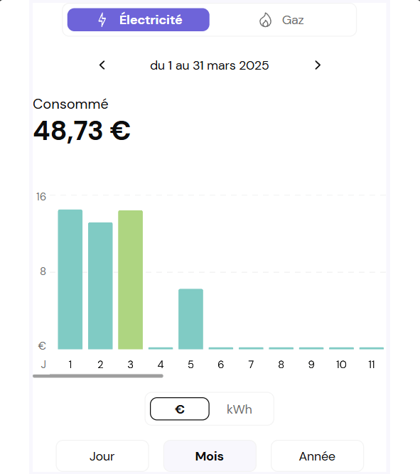
**Example where you override some styles in your global css**:
```css theme={null}
:root {
--dtn-graph-gas-bar-background: #ba68c8;
--dtn-graph-gas-bar-hovered-background: #ab47bc;
--dtn-graph-elec-bar-background: #80cbc4;
--dtn-graph-elec-bar-hovered-background: #aed581;
--dtn-graph-bar-radius: 2px;
}
```
See the result at the end of the section.
Note: every global variable starts with **--etc-xxx** for the global layer and **--dtn-xx** for the web-component layer.
#### 3.2.1 Results examples
# 4. Darkmode
Home interfaces' web components support both light and dark themes. By default, they follow the browser configuration and use dark or light colors according to the user's preferences. Both themes will use the colors chosen during the onboarding phase.
We understand that you may want to override this behavior. That's why we've added the `etc-theme-dark` and `etc-theme-light` classes to allow you to force the dark or light theme respectively, simply by updating one of the parent elements of the target web component(s).
Below is an example of how to do so.
```html theme={null}
```
 This screen demonstrates the default design system:
 ## 3. Post on-boarding
After the on-boarding phase everything is almost completed.
## 3. Post on-boarding
After the on-boarding phase everything is almost completed.
 # 4. Darkmode
Home interfaces' web components support both light and dark themes. By default, they follow the browser configuration and use dark or light colors according to the user's preferences. Both themes will use the colors chosen during the onboarding phase.
We understand that you may want to override this behavior. That's why we've added the `etc-theme-dark` and `etc-theme-light` classes to allow you to force the dark or light theme respectively, simply by updating one of the parent elements of the target web component(s).
Below is an example of how to do so.
```html theme={null}
# 4. Darkmode
Home interfaces' web components support both light and dark themes. By default, they follow the browser configuration and use dark or light colors according to the user's preferences. Both themes will use the colors chosen during the onboarding phase.
We understand that you may want to override this behavior. That's why we've added the `etc-theme-dark` and `etc-theme-light` classes to allow you to force the dark or light theme respectively, simply by updating one of the parent elements of the target web component(s).
Below is an example of how to do so.
```html theme={null}