

Functional description
Main feature
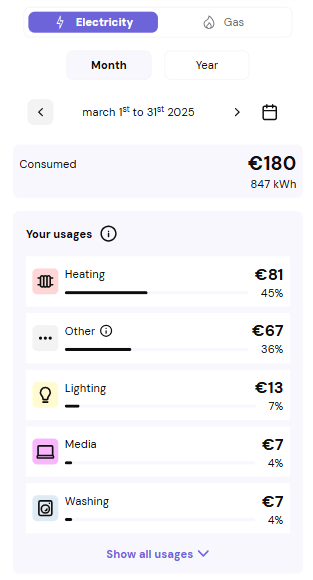
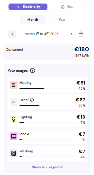
The usage breakdown web component allows users to understand what consumes the most energy at home, for both electricity and gas. Visualize an ordered list of usage consumption The component gives an overview of consumption by usage for a given period. By default, the client sees :- Total energy consumed during the previous month, in kWh and currency
Usage breakdown is not available for the current month because the calculation isn’t complete yet.
- The top 5 most consuming usages (electricity view)
- The consumption value in a given currency
- The percentage of each usage relative to the total consumption
Detailed features
Choose a period A user can view usage breakdown over two timeframes —year, month— using the dedicated period selector. Then, in each timeframe, a user can select a specific year or month using the datePicker element. Month timeframe- Displays the breakdown for a specific ended month
- Displays the breakdown from the beginning of the year
- Up to the previous month
For GDPR reasons, only the last 3 years are available.
- Up to 12 usages can be displayed
- By default : only the top 5
- Additional usages can be revealed via the dropdown
- Up to 3 usages
- All always displayed
- SIMFAST : Breakdown estimated solely from profile data
- REGIME : Based on monthly consumption + profile
- DISAGGREGATION : Based on detailed daily consumption + profile
For multi‑month periods using multiple algorithms, the tooltip displays the least accurate one.
Error and information messages handling
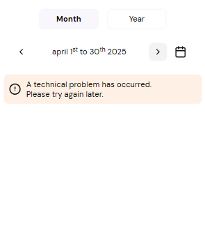
The usage breakdown may not display in the following cases : Use case 1 : Breakdown not available for current month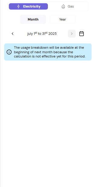
Loading state handling
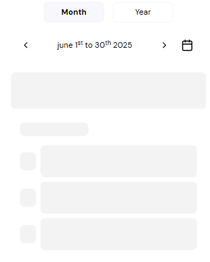
When data takes time to load (slow network or API > 300 ms), a skeleton is displayed to :- indicate that data is loading
- preview how the list will appear
Responsiveness
The usage breakdown interface is fully responsive. Desktop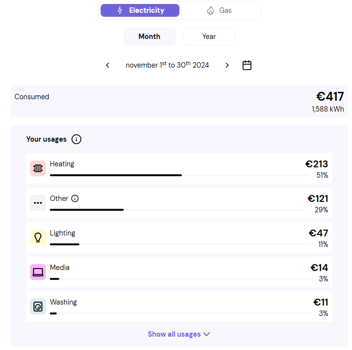
Provider customization
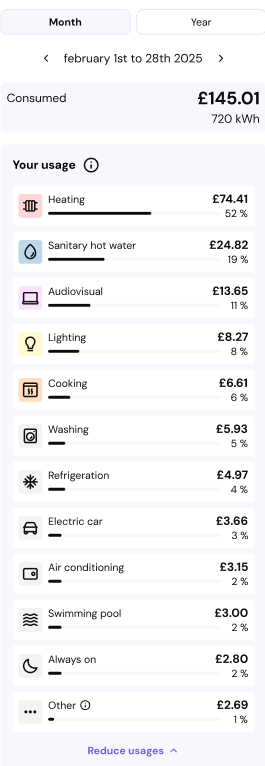
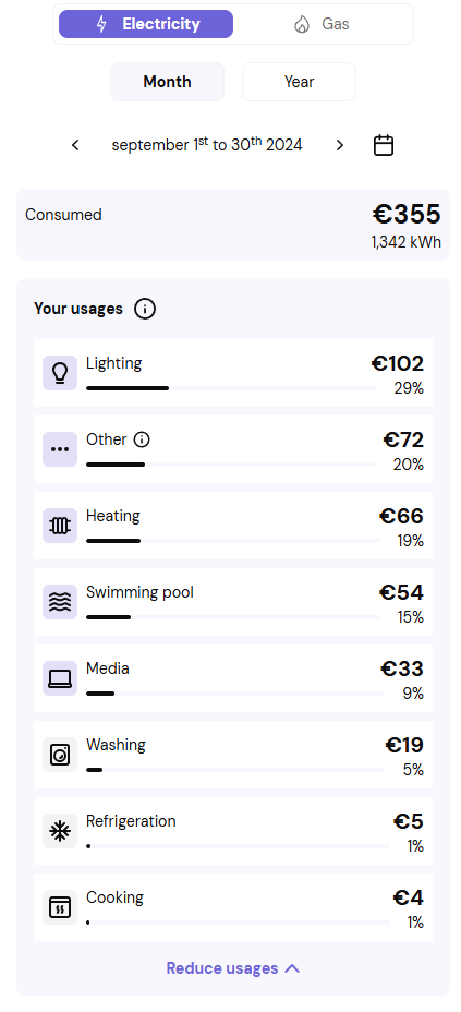
Each usage is associated with a pictogram. The component offers two display modes : Polychromatic mode Each usage has a colored pictogram depending on category :Only the first 5 usages have a colored background.
The rest (behind the “Show all usages” dropdown) are grey to highlight major consumers.
In the gas view, all usages have a colored background.
Language management
The web component supports multiple languages. Below an example in french :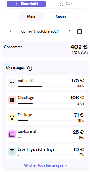
Accessibility
The component is developed following the RGAA (French General Accessibility Improvement Framework) requirements and accessibility best practices. Examples of RGAA accessibility requirements implemented in thedtn-usage-breakdown web component include :
- The usage list is an ordered list, meaning that the screen reader will respect the usage arrangement (from the highest to the lowest usage in terms of consumption).
- When users decide to display more usage, the screen reader will notify them that more usage are displayed.
- The keyboard navigation follows the pattern below :
- Fluid switch
- Step switch
- Datepicker
- Consumption header
- Algorithm information button
- All usages (one by one)
The accessibility of this web component does not imply that the entire page where it is integrated is accessible. Accessibility compliance must be assessed at page level, including any surrounding content, custom code, and third-party components provided by the integrating application.
API used to display consumption data
Usage breakdown is provided by the monthly usage breakdown API (see detailed API documentation).Integration of the web component ‘Consumption disaggregation’